PRODUCT DESIGN / CASE STUDY
Favorites Part 2
The first Favorites redesign made saved products easier to access, but the navigation dropdown left little room for more advanced organization. In the second phase, I explored a dedicated Favorites page with custom lists, stronger filtering, and clearer ways to manage saved products.
COMPANY
FashionGo
ROLE
UX Research and Interaction Design
TIMEFRAME
2018
TOOLS
Adobe XD
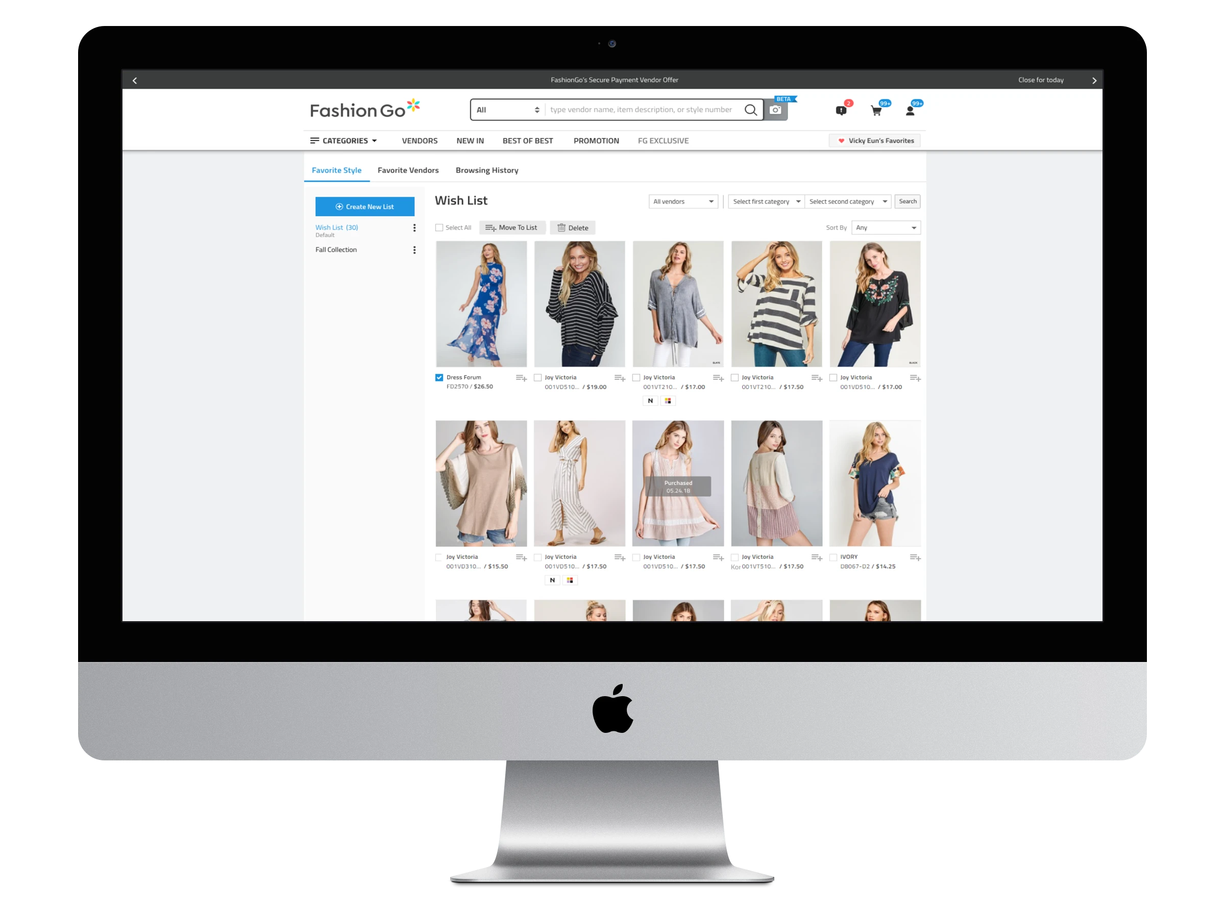
The second redesign moved Favorites into a dedicated page with more space for organizing and browsing saved products.
Project overview
The first redesign made Favorites much easier to reach, but we quickly ran into the limits of fitting everything inside the navigation. For Part 2, I explored what Favorites could become with a page of its own, giving us room for better organization, filtering, and list management.
My role
I developed the interaction model for the expanded Favorites system, defined its feature structure and task flows, created and revised wireframes, and participated in two rounds of usability testing.
The work evolved through stakeholder review, internal testing, and research with FashionGo buyers at the Magic 2018 convention.
Building on the first release
Vendor sorting was one of the ideas we had to leave behind in the first release. Moving Favorites to a dedicated page gave me a chance to revisit that problem while thinking more broadly about how buyers could organize everything they had saved.
Mapping the feature
I started by mapping out the major pieces of the experience: Favorite Styles, Favorite Vendors, and Browsing History. From there, I worked through the tasks buyers would need to accomplish—saving products, creating and managing lists, choosing a default list, and moving products from one list to another.
Organizing three related areas
Favorite Styles supported saved products, list management, item movement, filtering, and sorting. Favorite Vendors organized saved vendors through categories and vendor types. Browsing History organized previously viewed products chronologically with time ranges and filters.
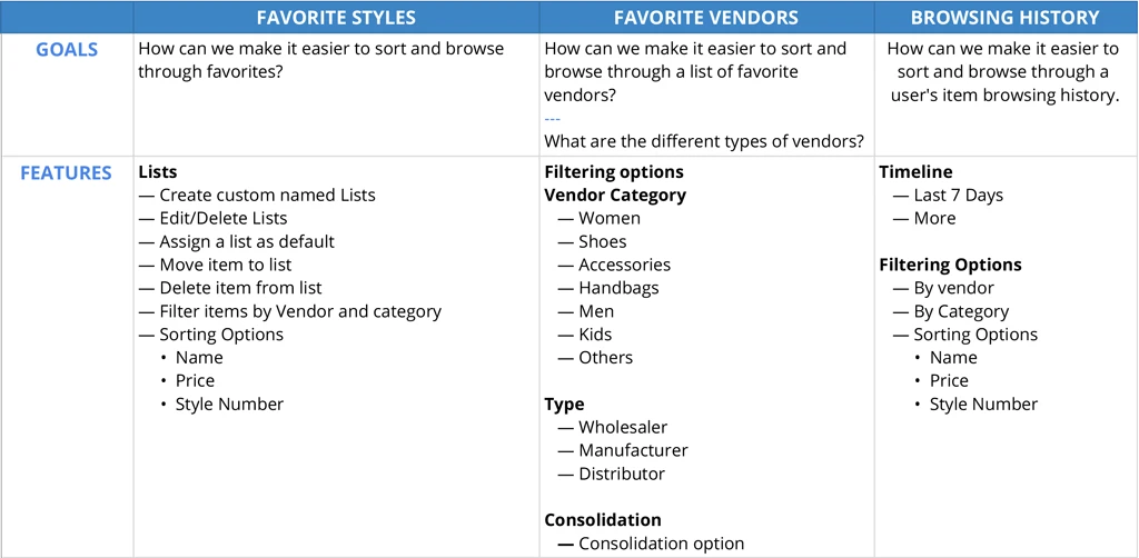
The feature map defined the goals and supporting capabilities for Favorite Styles, Favorite Vendors, and Browsing History.
Mapping list-management tasks
I mapped the tasks buyers would need to complete within the expanded system: save a product, create a list, set a default list, edit or delete a list, and move a product into another list.
This exposed the number of decisions the interface had to support without making everyday actions feel heavy.
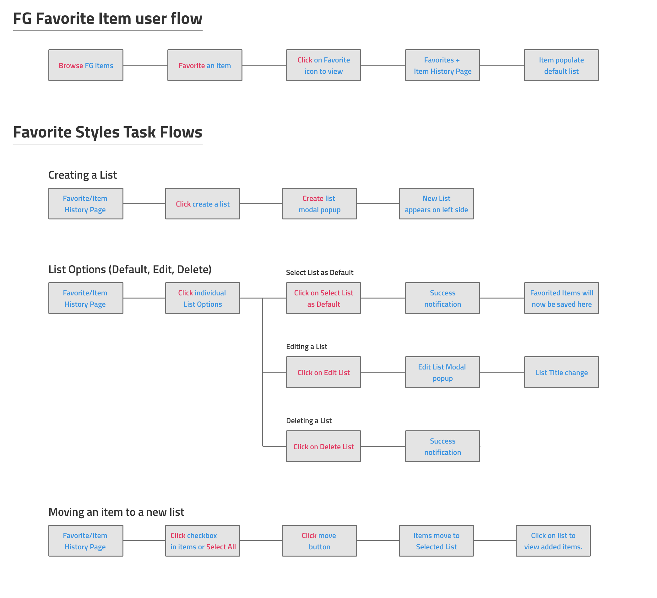
Task flows connected favoriting an item with list creation, list settings, and moving products between collections.
Exploring the dedicated page
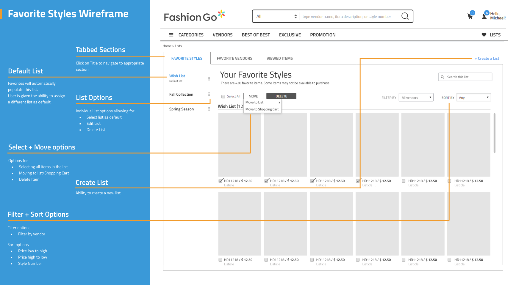
My early wireframes used tabs to separate Favorite Styles, Favorite Vendors, Viewed Items, and Timeline. I also explored how list management, filtering, and sorting could work now that we weren’t trying to squeeze everything into the navigation.
Favorite Styles
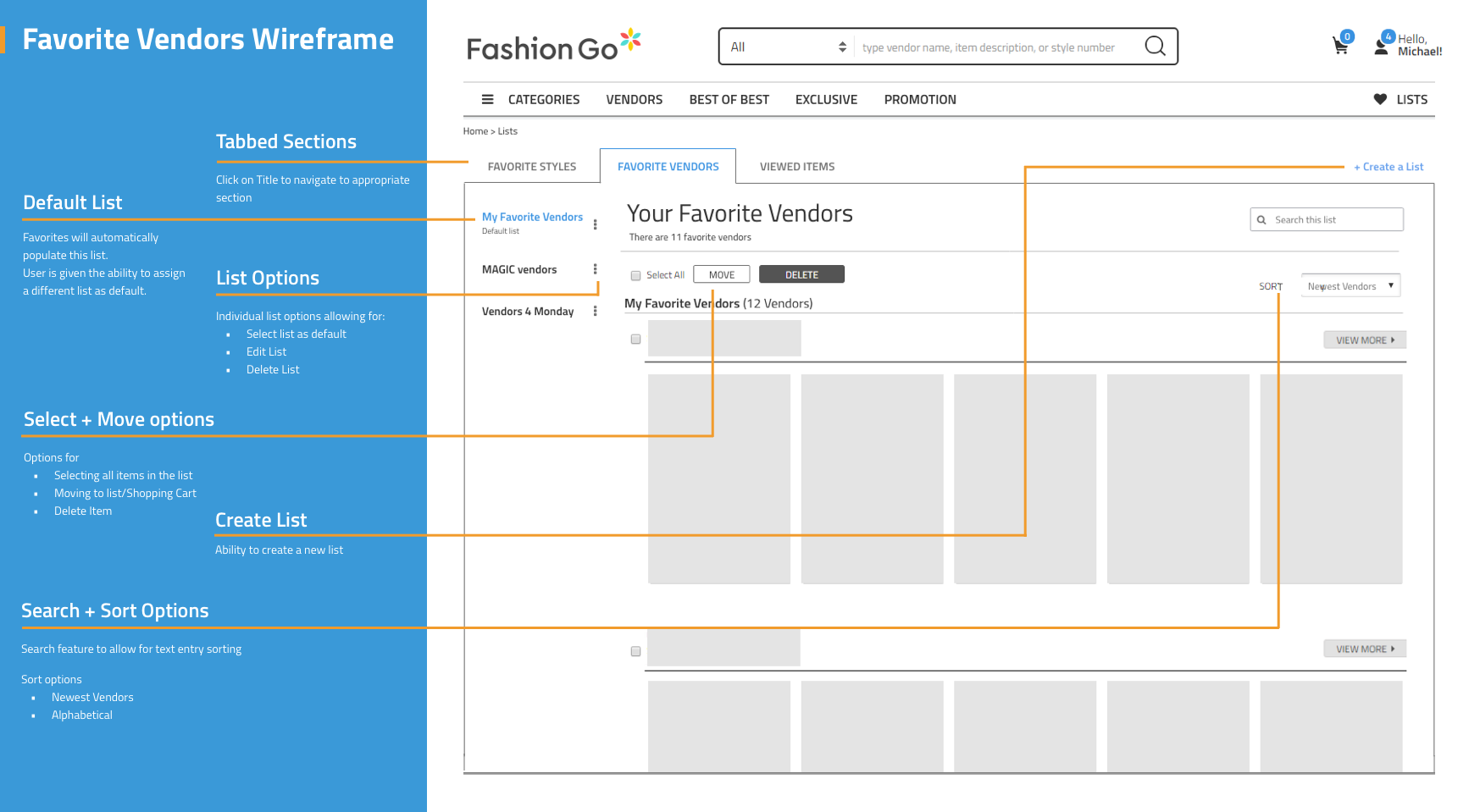
Favorite Vendors
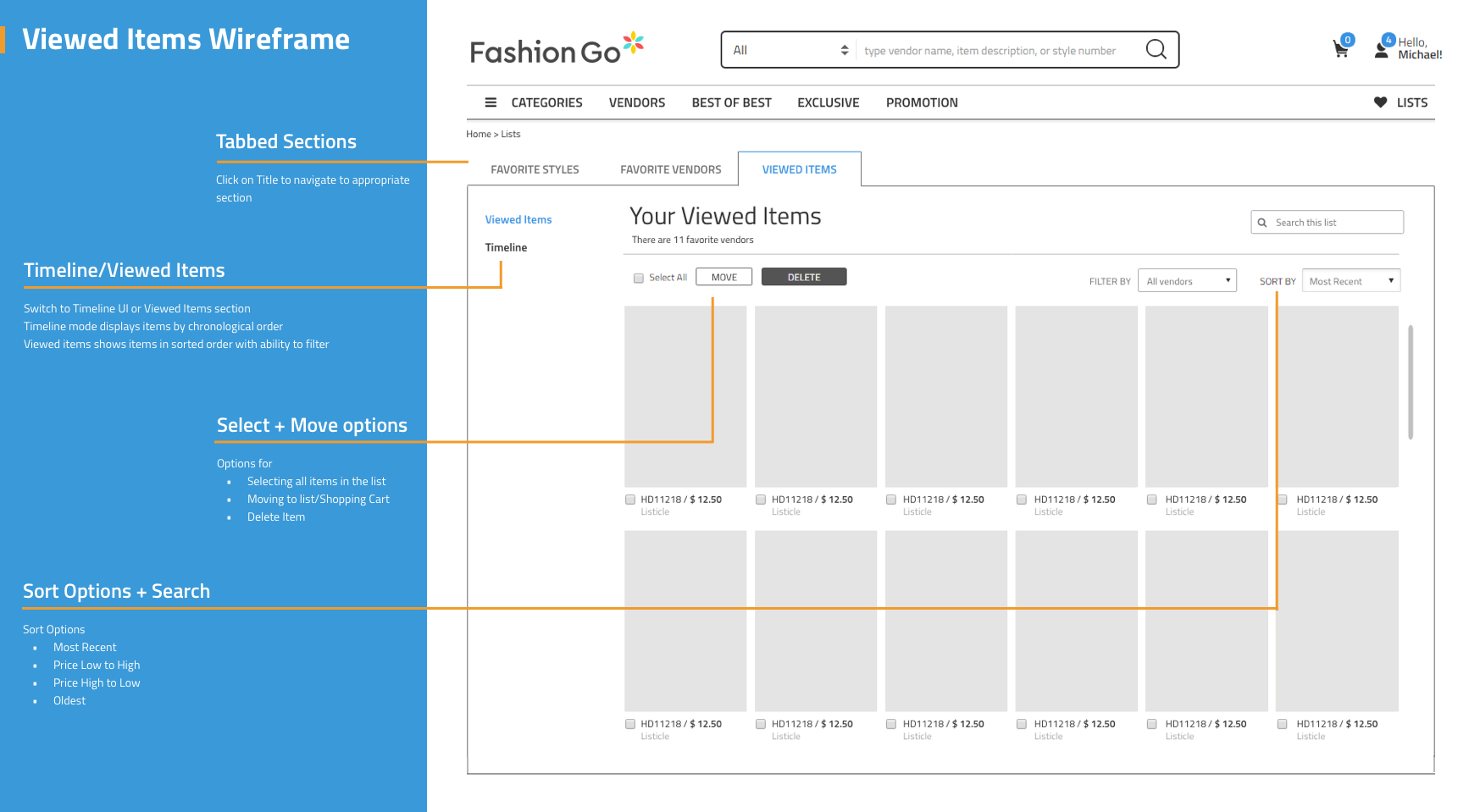
Viewed Items
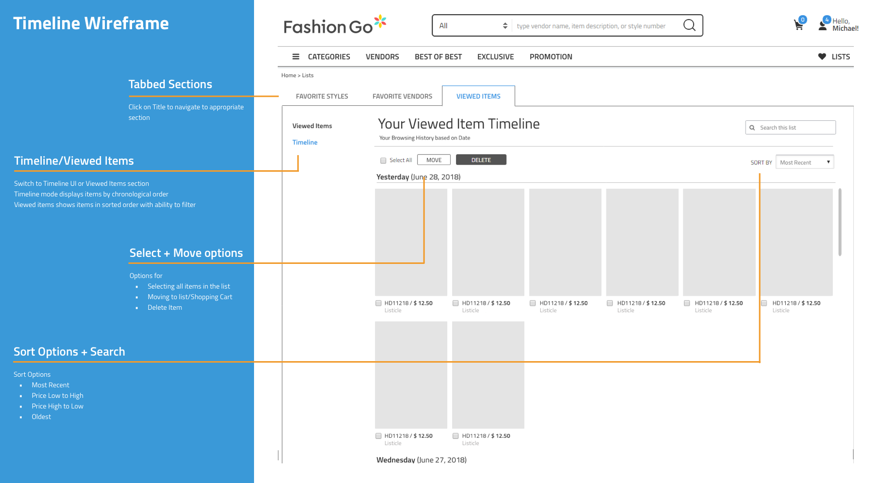
Timeline
Favorite Styles
Reconsidering the default destination
One early idea was to open Favorites directly on the Timeline. During review, though, we started questioning whether that was really what buyers expected to see first. That became one of the things I wanted to test.
User testing round 1
For the first usability test, we recruited 12 employees from NHN Global—half were already familiar with FashionGo, while the other half had little or no experience with it. I gave them a series of tasks around finding Favorites, using Browsing History, creating and managing lists, and setting a default list.
What we observed
The test exposed a few problems pretty quickly. More than 40% of participants missed the Browsing History label entirely, and 60% thought it was strange for Favorites to open there by default. Most participants also gravitated toward the page-level controls, while the plus icon left 40% unsure of what it would do.
Revising the hierarchy and actions
Based on what we saw, I made Favorite Styles the default view, made creating a new list much more explicit, and reworked the item controls that had caused confusion.
BEFORE / INITIAL WIREFRAME
AFTER / REVISED DESIGN

Testing led to a clearer default destination, a labeled list-creation action, and more explicit controls for saved products.
Favorite Styles
For Favorite Styles, I kept the filtering patterns buyers already knew from FashionGo and layered the new list-management tools around them rather than reinventing the whole interaction.
The revised Favorite Styles page combined familiar filtering patterns with custom lists and item-management controls.
Favorite Vendors
I originally explored custom lists for Favorite Vendors as well, but the interaction was becoming more complicated than it needed to be. I simplified the final direction around category and type filters instead.
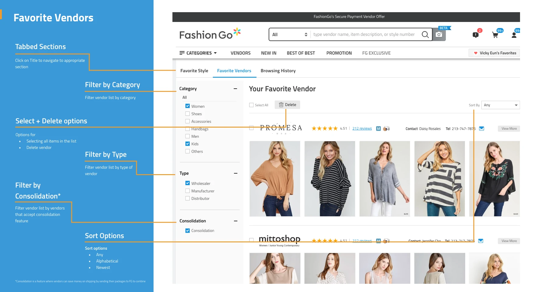
Favorite Vendors replaced custom vendor lists with category and vendor-type filters.
Browsing History
Timeline and Viewed Items were also trying to solve closely related problems, so I combined them into a single Browsing History experience.
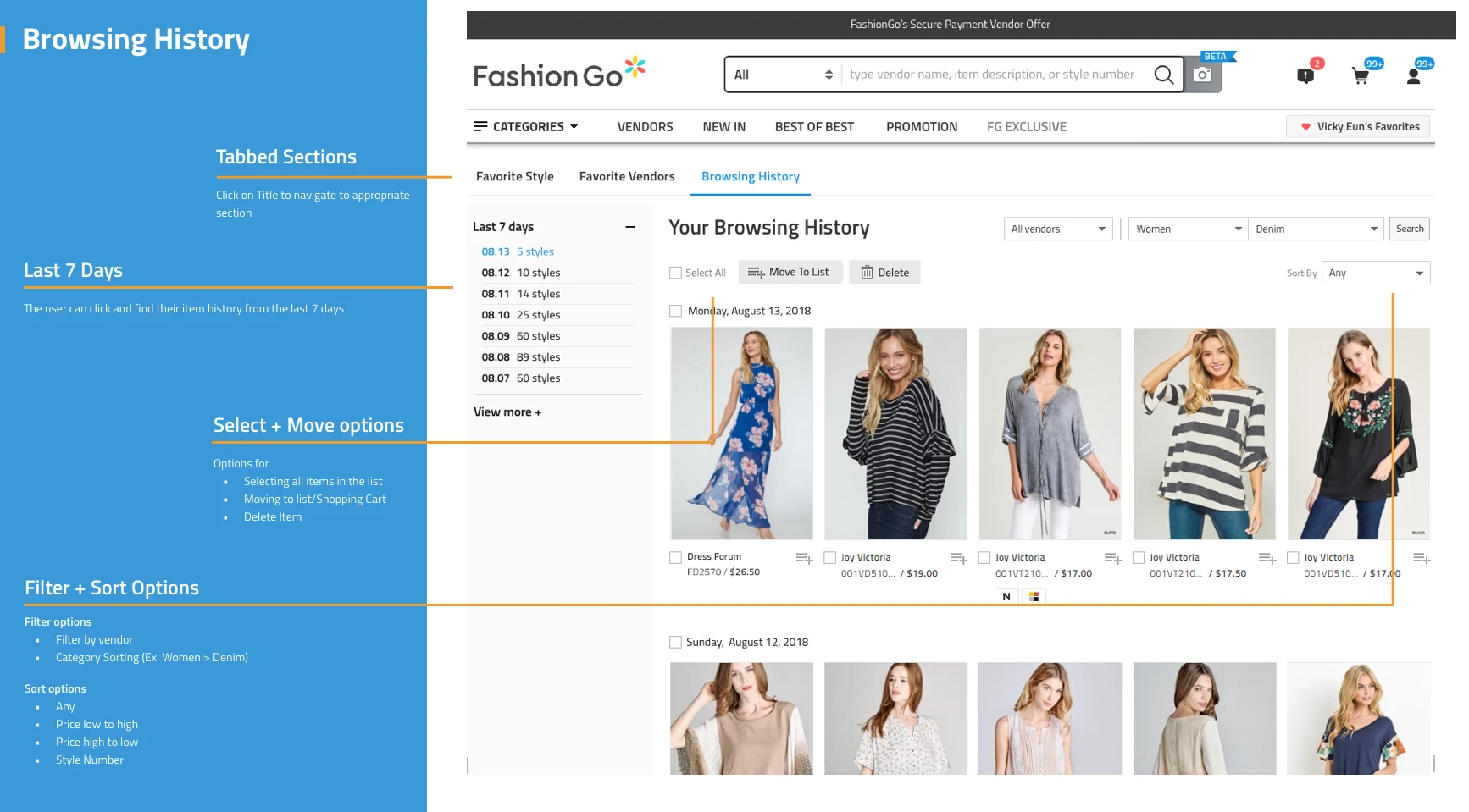
Browsing History combined the earlier Timeline and Viewed Items concepts into one chronological view.
Testing with FashionGo buyers at MAGIC
After our first round of testing, we wanted to put the revised experience in front of actual FashionGo customers. MAGIC, a major fashion industry trade show in Las Vegas, gave us that opportunity. We then recruited registered FashionGo buyers attending the event to participate in our research.
Our UX team prepared interviews and usability tests covering different parts of FashionGo. For Favorites, I focused on six tasks around finding saved products, browsing history, and creating and managing lists.
I also helped bring the team’s work together into the larger prototype we took to MAGIC for testing. Six FashionGo buyers ultimately participated in the Favorites portion.
What we learned at MAGIC
Across the six Favorites tasks, participants completed an average of 75.5% successfully. Since none of the participants had used the new functionality before, the test gave us a useful look at what people understood right away and where they still got stuck.
Individual actions generally tested well, but moving between the tabbed sections remained the biggest source of confusion. Buyers responded positively to being able to create their own lists, which gave us confidence in the overall direction while showing us where the navigation still needed work.
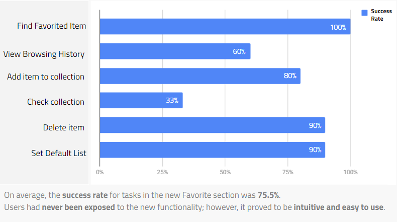
Six FashionGo buyers completed six Favorites tasks at MAGIC, with an average task-success rate of 75.5%. This was a usability-test result, not a business-impact metric.
What we learned
Moving Favorites to a dedicated page created room for the organization and filtering capabilities that the dropdown could not support. Testing also showed that adding functionality was only part of the challenge: buyers needed a clearer mental model for moving between saved products, vendors, and browsing history.
This work had not launched when I originally documented the project, so I couldn’t measure its impact in production. The two rounds of testing instead helped us validate the direction and identify the parts of the experience that still needed refinement.