PRODUCT DESIGN / CASE STUDY
FashionGo buyers needed a better way to revisit products across a marketplace containing hundreds of vendors and thousands of styles. I redesigned the existing Favorites experience to make saved items more visible, accessible, and easier to browse.
COMPANY
FashionGo
ROLE
Interaction Design
TIMEFRAME
2018
TOOLS
Adobe XD

FashionGo Favorites, the first phase of a two-part redesign of the saved-product experience.
Project overview
Favorites was part of a larger redesign of the FashionGo homepage. Buyers already had a way to save products, but getting back to them meant working through a small, limited panel. My goal was to make Favorites easier to access and browse without making the experience feel unfamiliar to returning users.
My role
I worked with the FashionGo UXD team throughout the redesign, from reviewing our existing research and mapping the current experience to exploring ideas, building the prototype, and preparing the final design for development.
The existing experience constrained discovery
Favorites originally lived in a small panel on the right side of the homepage. It worked for a handful of saved products, but buyers could only see a few at a time and had to click through them using arrows. As that collection grew, finding something you had saved became increasingly cumbersome.
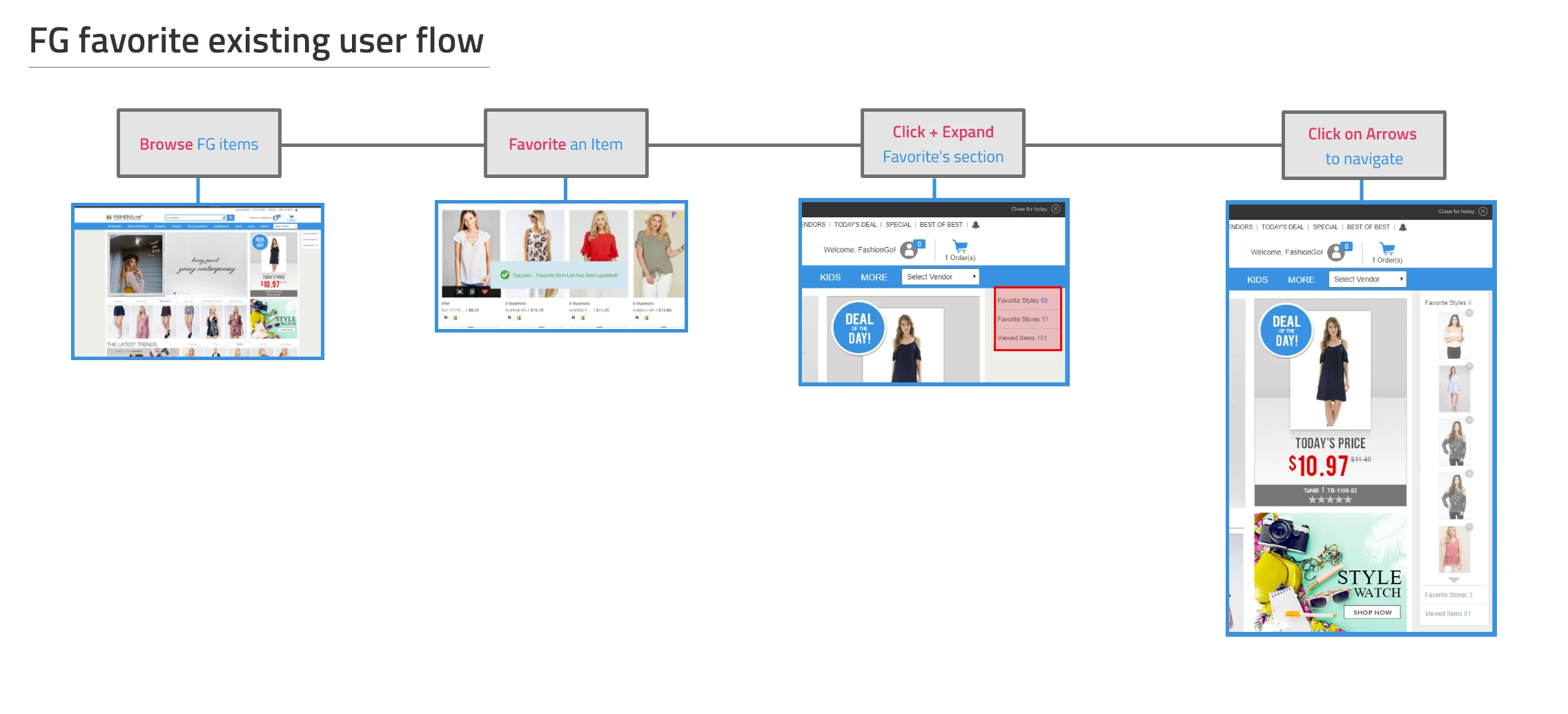
The original flow ended in a constrained panel that limited how many favorites a buyer could see at once.
Working with existing evidence
We didn’t have time to run a new round of research for this phase, so I went back through surveys and interviews the UX team had already conducted. One important piece of context was that 92% of FashionGo users were returning users, so improving Favorites couldn’t come at the expense of making the site suddenly feel unfamiliar.
What users needed
01
Buyers wanted a better way to organize Favorites by vendor.
02
They also wanted an easier way to take something out of their cart without losing track of it completely.
Rethinking Favorites as persistent navigation
I started exploring what Favorites could look like if it wasn’t tied to that small homepage panel at all. Moving it into the primary navigation meant buyers could get to their saved products from anywhere on FashionGo, while the larger layout gave us room for vertical scrolling, clearer groups, and an early approach to sorting by vendor.
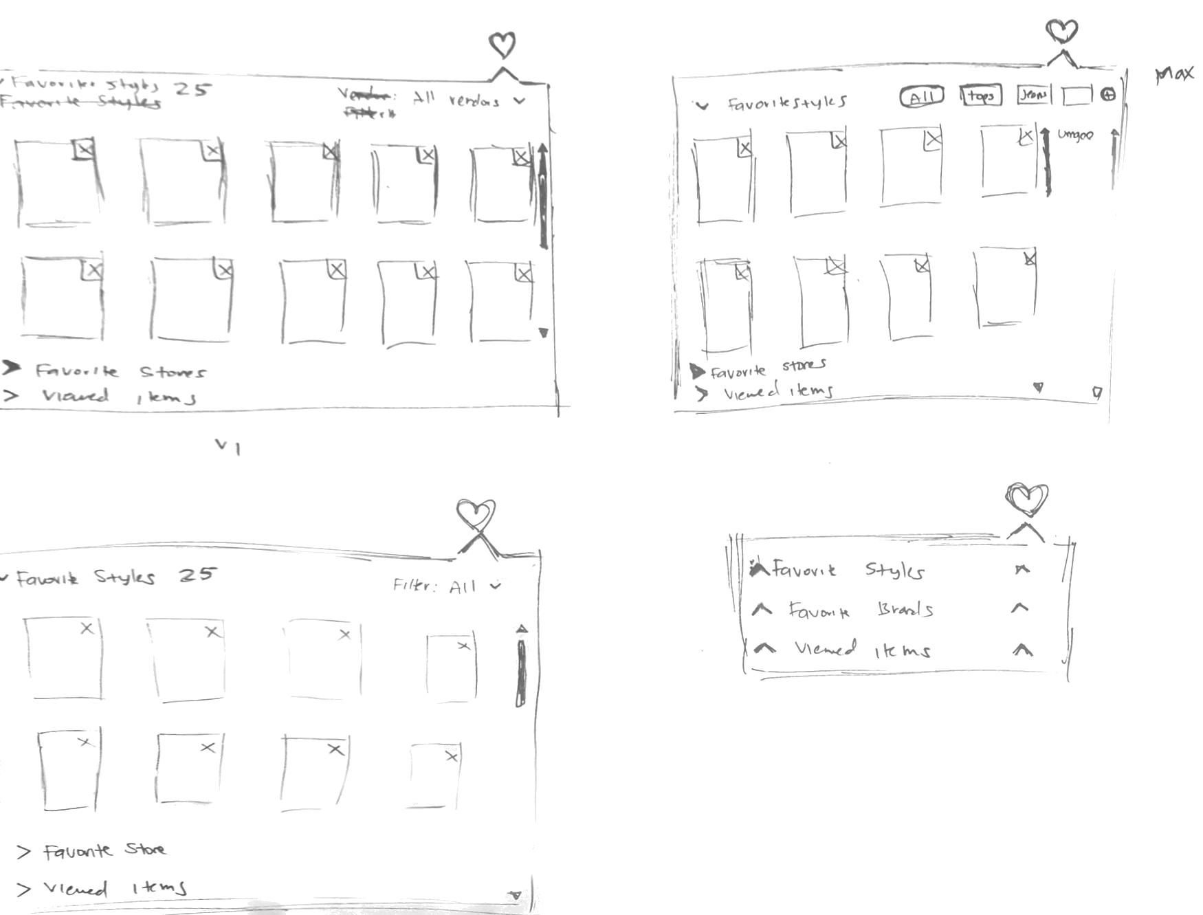
Sketches explored a wider navigation treatment, clearer groupings, vertical scrolling, and vendor-based filtering.
Prototyping the new interaction
Once we settled on a direction, I built a mid-fidelity prototype to work through how Favorites would open from the navigation and how the three sections would behave. This gave both design and development something concrete to review before we moved into implementation.

The mid-fidelity concept moved Favorites into the navigation and increased the visible browsing area.
Preparing for the first version
The first version shipped with the redesigned FashionGo homepage, although not everything from the prototype made it into launch. We ultimately removed vendor sorting after learning that the modal approach would generate too many server calls.
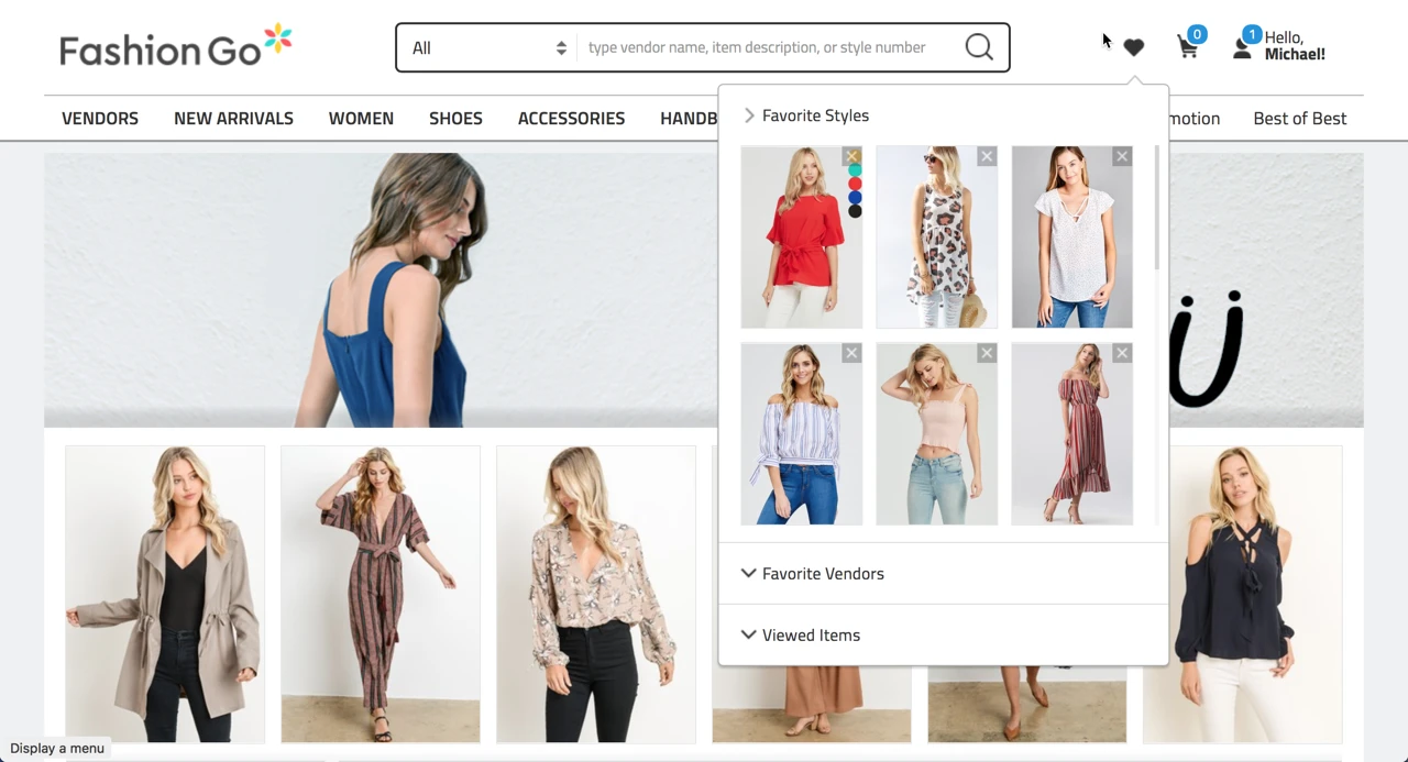
The launched experience made Favorites more visible and expanded the amount of saved content buyers could browse.
What we learned
The new version gave buyers much easier access to Favorites and considerably more room to browse what they had saved. Feedback was generally positive, but after launch it became clear that a navigation dropdown could only take the feature so far. If we wanted better organization and management tools, Favorites needed more space. That became the starting point for Part 2.